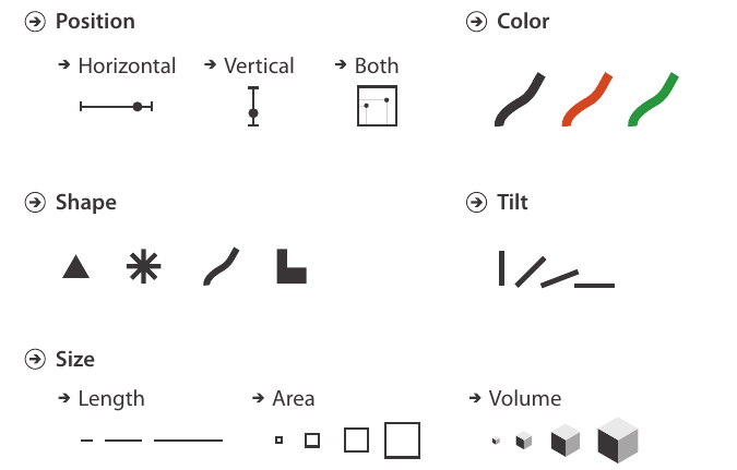
Data visualisation
from a communication perspective
European Data Incubator
Bilbao, 9th November 2018
1. Data visualisation as an artefact The atomic level
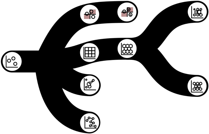
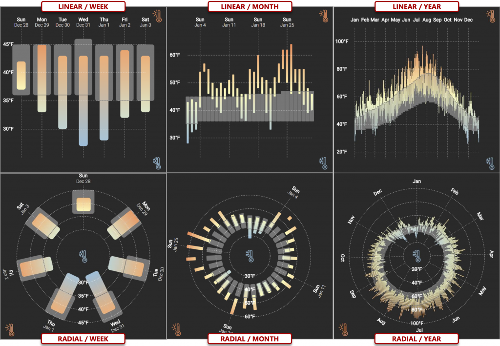
2. Split data into multiple charts
Facets, trellis, small multiples.
1. Data visualisation as an artefact The atomic level
3. Augmenting visualisations
1. Data visualisation as an artefact The atomic level
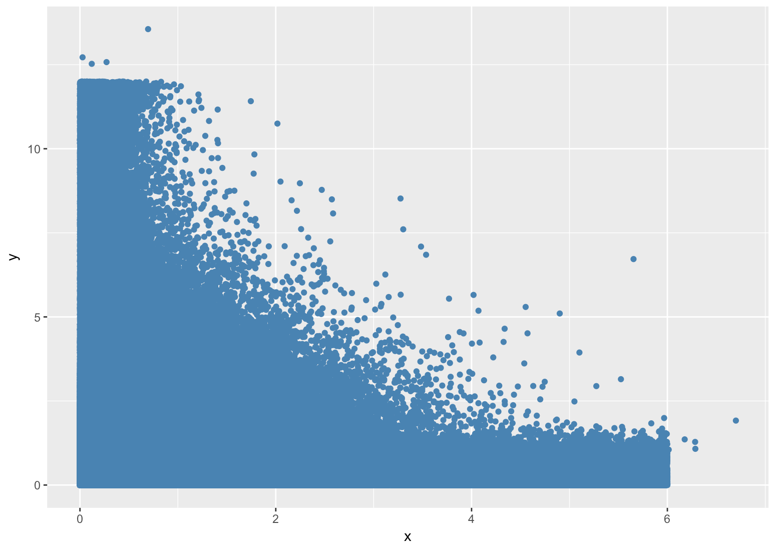
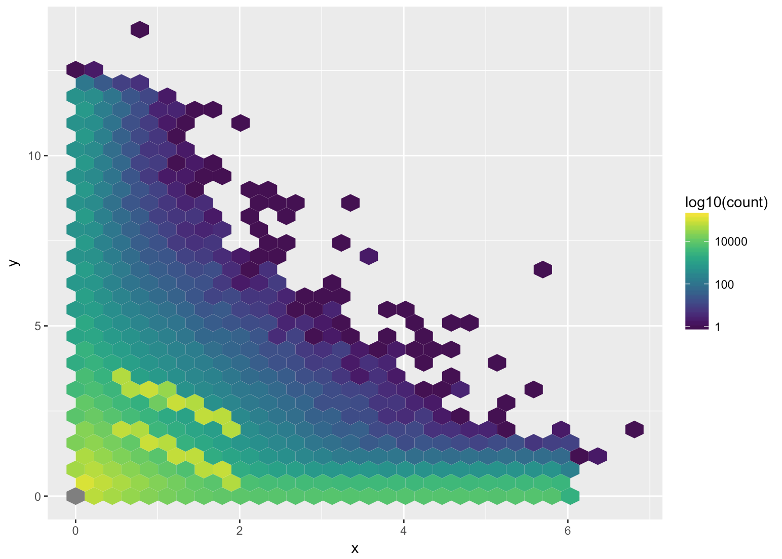
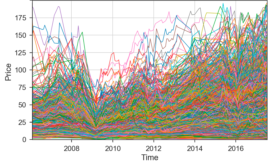
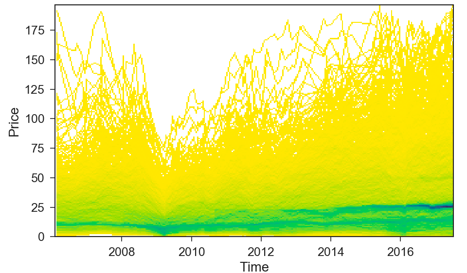
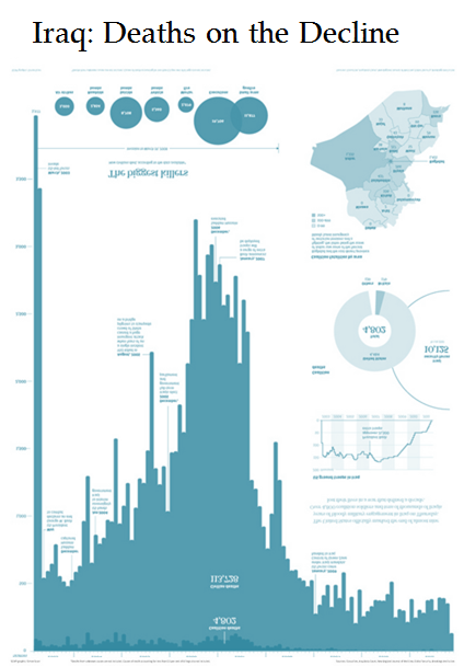
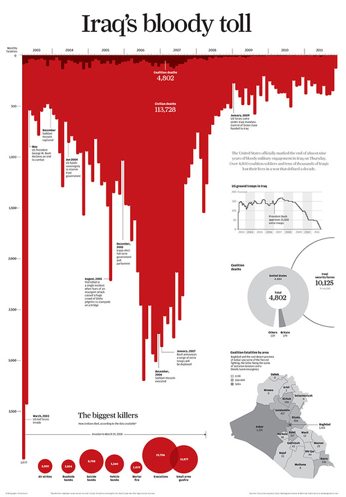
4. Densify
- Escaping overplotting in scatterplots
1. Data visualisation as an artefact The atomic level
4. Densify
- Escaping overplotting in scatterplots

1. Data visualisation as an artefact The atomic level
4. Densify
- Escaping overplotting in scatterplots
1. Data visualisation as an artefact The atomic level
4. Densify
- Timelines
1. Data visualisation as an artefact The atomic level
4. Densify
- Timelines
1. Data visualisation as an artefact The atomic level
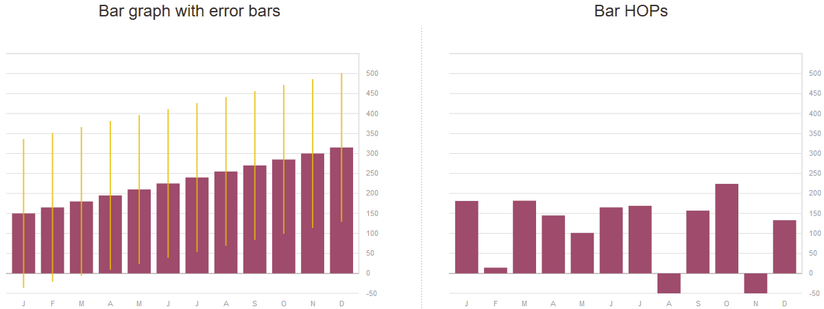
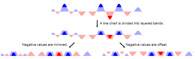
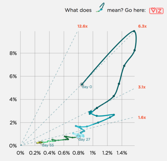
Communicating uncertainty, projections,
and other non-factual data is challenging.
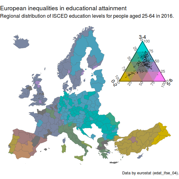
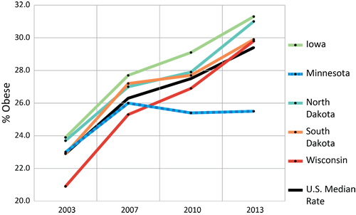
1. Data visualisation as an artefact Number of variables
1. Data visualisation as an artefact Generating new idioms
1. Data visualisation as an artefact Generating new idioms
tricolore (Schöley 2018)1. Data visualisation as an artefact Generating new idioms

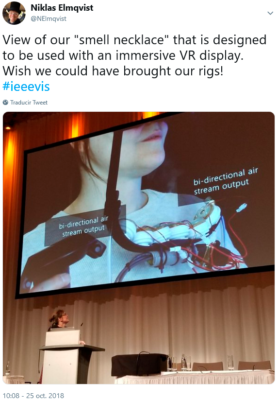
1. Data visualisation as an artefact Other senses
1. Data visualisation as an artefact Other senses
2. Data visualisation as a communication product What charts say
|
|
2. Data visualisation as a communication product What charts mean
Historically
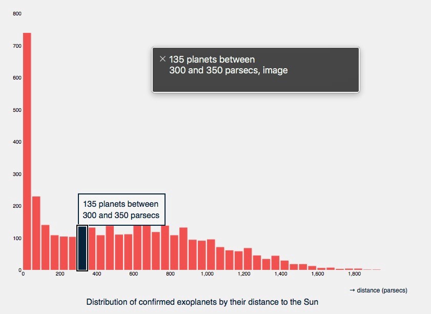
2. Data visualisation as a communication product What charts do
Provide insights
Identify and emphasize the insights that the readers might expect.
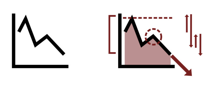
which may be considered insights by an audience (Meeks 2018)
2. Data visualisation as a communication product What charts do
Cause visual literacy
2. Data visualisation as a communication product What charts do
Create new charts
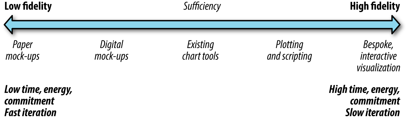
3. The artefact goes social Data counseling
Rapid prototyping
3. The artefact goes social Responsive data visualisation
Different views on heartreate depending on device:
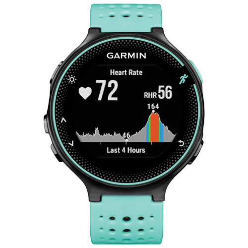
3. The artefact goes social Responsive data visualisation
Different views on heartreate depending on device:
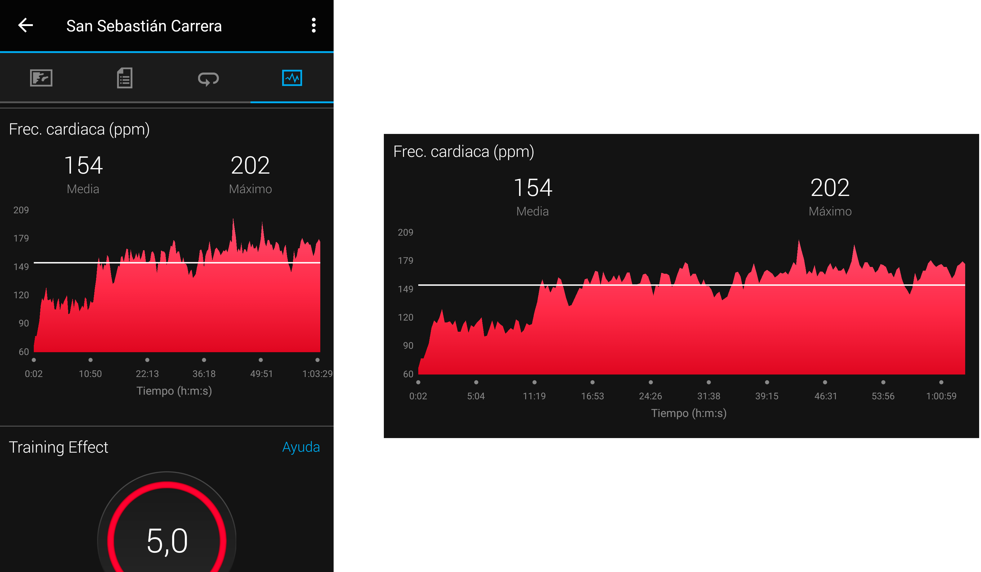
3. The artefact goes social Responsive data visualisation
Different views on heartreate depending on device:
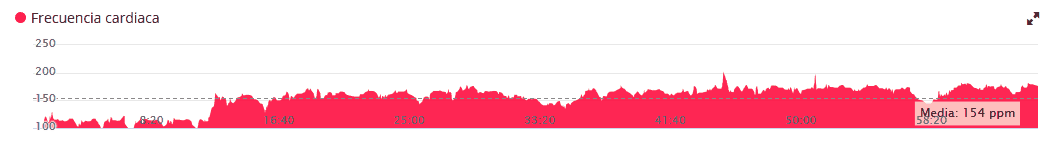
3. The artefact goes social Responsive data visualisation
Thank you!
This presentation is available at
https://mrn.bz/BDAP2018
References
Anthony Aragues (2018), Visualizing Streaming Data. O’Reilly Media
Tanja Blascheck, Lonni Besançon, Anastasia Bezerianos, Bongshin Lee, Petra Isenberg (2019). “Glanceable Visualization: Studies of Data Comparison Performance on Smartwatches”. IEEE Transactions on Visualization and Computer Graphics 25(1) 10.1109/TVCG.2018.2865142`
Matthew Brehmer, Bongshin Lee, Petra Isenberg, Eun Kyoung Choe (2019). “Visualizing Ranges over Time on Mobile Phones: A Task-Based Crowdsourced Evaluation”. IEEE Transactions on Visualization and Computer Graphics 25(1) 10.1109/TVCG.2018.2865234
Brendan Gregg (2016), “The Flame Graph”. ACM Queue 14(2)
Luc Guillemot (2018), “How Does This Data Sound?”
Jeffrey Heer, Nicholas Kong, Maneesh Agrawala (2009), “Sizing the Horizon: The Effects of Chart Size and Layering on the Graphical Perception of Time Series Visualizations”. ACM Human Factors in Computing Systems (CHI), pp. 1303 - 1312 10.1145/1518701.1518897
Bill Hinderman (2015), Building Responsive Data Visualization for the Web. O’Reilly
Christophe Hurter, Nathalie Henry Riche, Steven M. Drucker, Maxime Cordeil, Richard Alligier, Romain Vuillemot (2018), “FiberClay: Sculpting Three Dimensional Trajectories to Reveal Structural Insights”, IEEE Transactions on Visualization and Computer Graphics 25(1)
Alex Kale, Francis Nguyen, Matthew Kay, Jessica Hullman (2019), “Hypothetical Outcome Plots Help Untrained Observers Judge Trends in Ambiguous Data”, IEEE Transactions on Visualization and Computer Graphics 25(1)
Andy Kirk (2014), “The Design of Nothing: Null, Zero, Blank”, OpenVis Conference 2014
Ihor Kovalyshyn (2017), “When Scatter Plot Doesn’t Work”
Ricardo Langner, Ulrike Kister, Raimund Dachselt (2019). “Multiple Coordinated Views at Large Displays for Multiple Users: Empirical Findings on User Behavior, Movements, and Distances”, IEEE Transactions on Visualization and Computer Graphics 25(1) (proc. InfoVis 2018) 10.1109/TVCG.2018.2865235
Elijah Meeks (2017), “Strategic Innovation in Data Visualization Will Not Come From Tech”
— (2018), “Data Visualization, Fast and Slow”
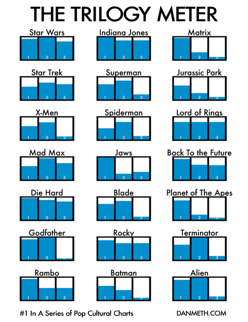
Dan Meth (2009), “The Trilogy Meter”
Miriah Meyer & Danyel Fisher (2018), Making Data Visual. O’Reilly Media
Dominik Moritz and Danyel Fisher (2018), “Visualizing a Million Time Serieswith the Density Line Chart” arXiv:1808.06019v2 [cs.HC]
Tamara Munzner (2015). Visualization Analysis and Design. CRC Press
Jonas Schöley (2018), “Choropleth maps with tricolore”
Ronell Sicat, Jiabao Li. DXR: A Toolkit for Building Immersive Data Visualizations
License
![]()


Copyright © 2018 University of Deusto
This work (except for the quoted images, whose rights are reserved to their owners) is licensed under the Creative Commons “Attribution-ShareAlike” License. To view a copy of this license, visit http://creativecommons.org/licenses/by-sa/3.0/