Visual Analytics
Visual Analytics
Communicating data-driven insights
through data visualization techniques
and useful dashboards
miren.berasategi@deusto.es
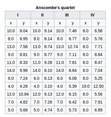
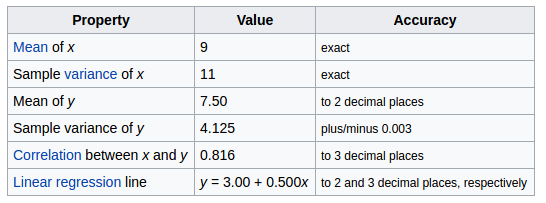
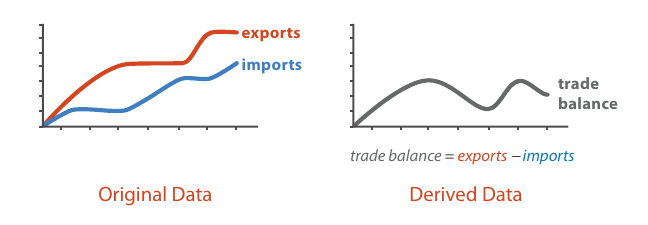
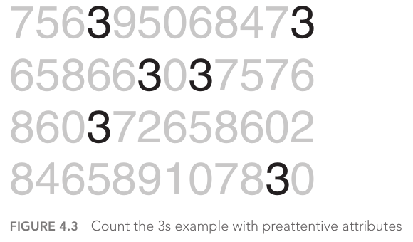
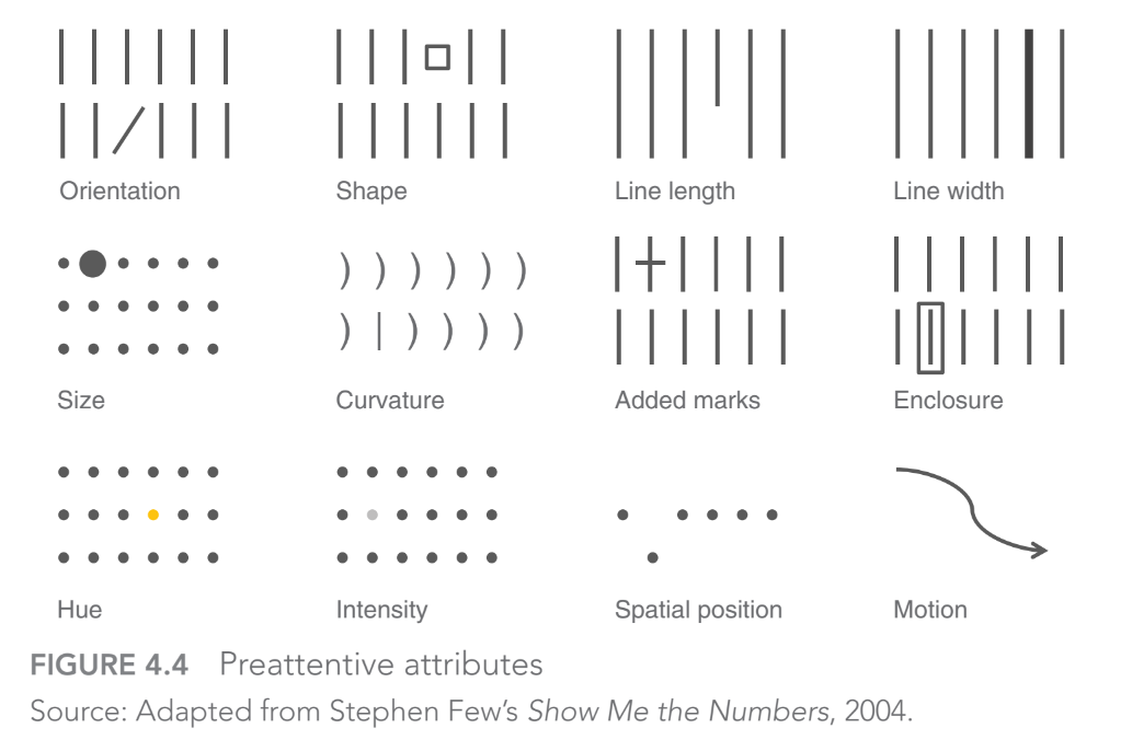
0.2 Why use visualization

0.3 What to use visualization for
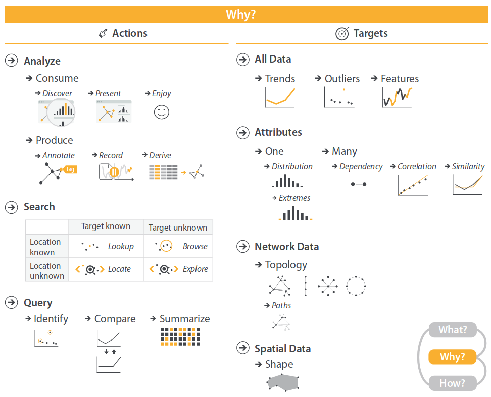
0.3 What to use visualization for
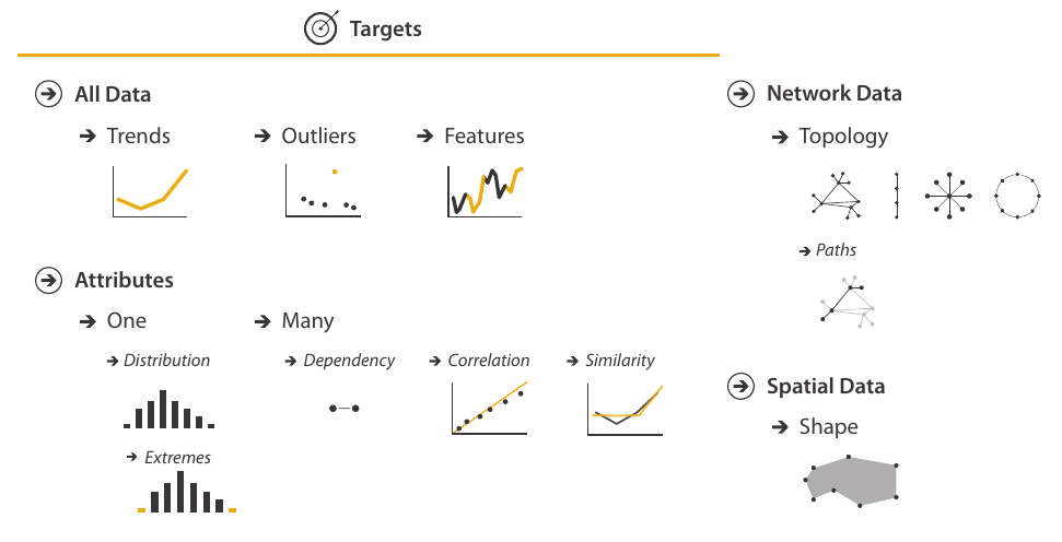
0.3 What to use visualization for

0.3 What to use visualization for
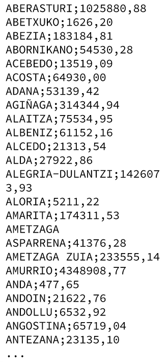
Practice: meet our sample data
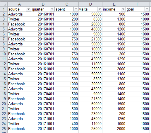
Download and open data.xls: fake data for online marketing goals and tools
from Google Drive or http://mrn.bz/MUMA2018data
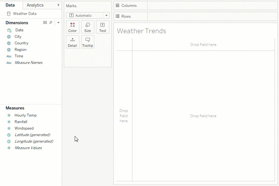
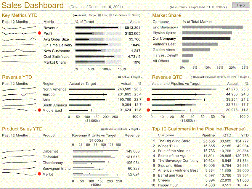
Tableau Software
![]()
1.2.1 Marks
A mark is a basic graphical element in an image
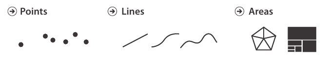
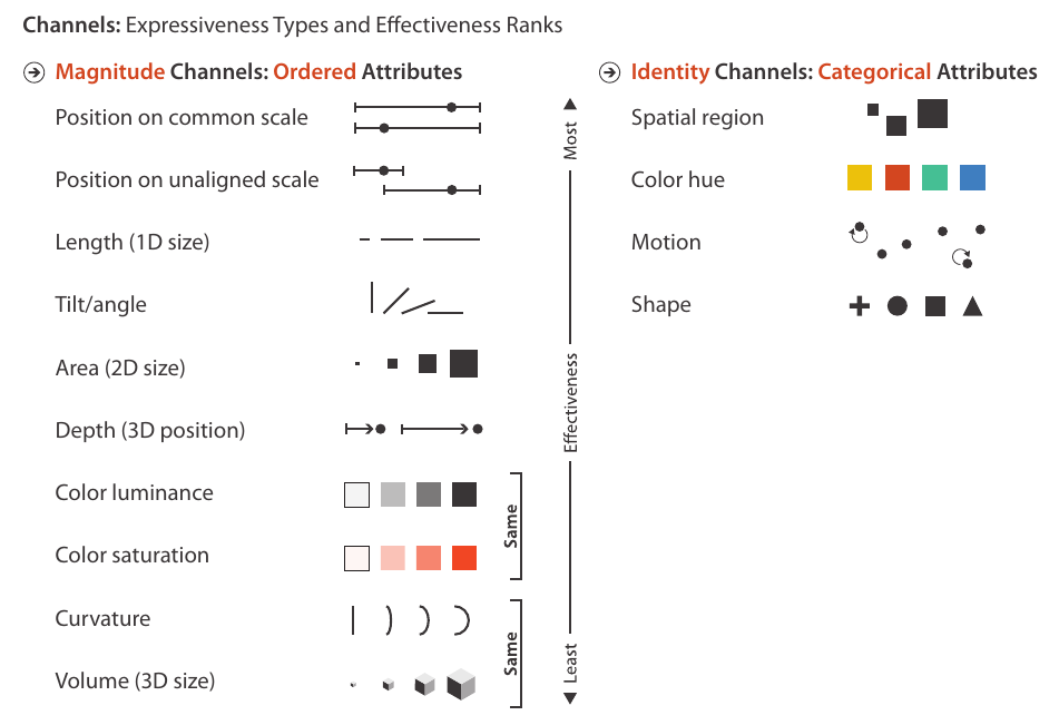
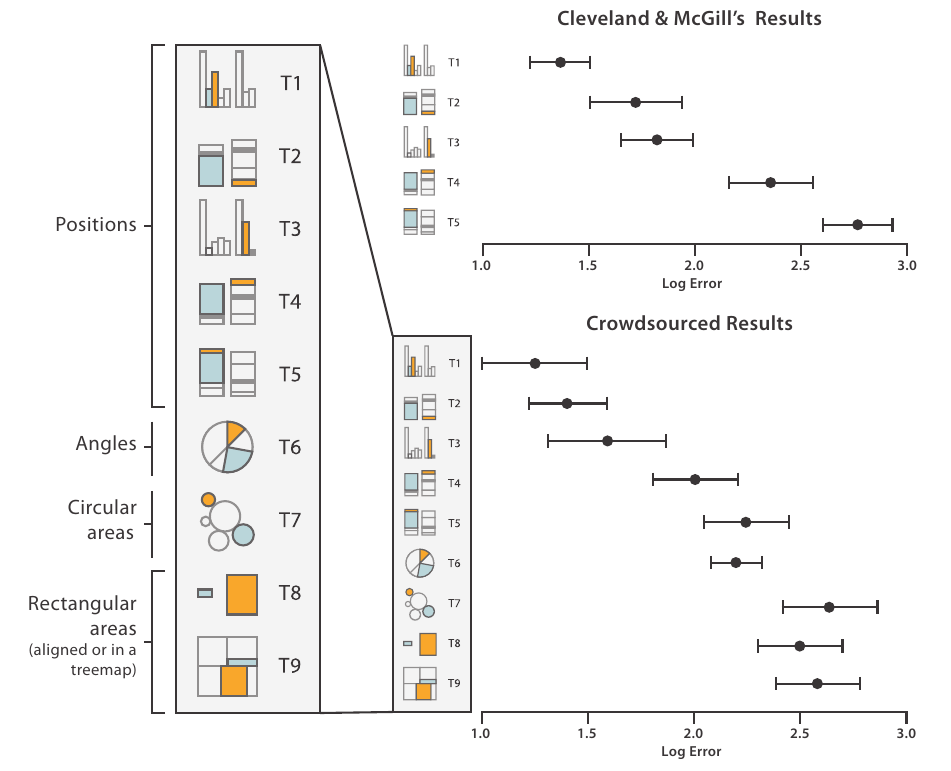
1.2.2 Channels
A visual channel is a way to control the appearance of marks
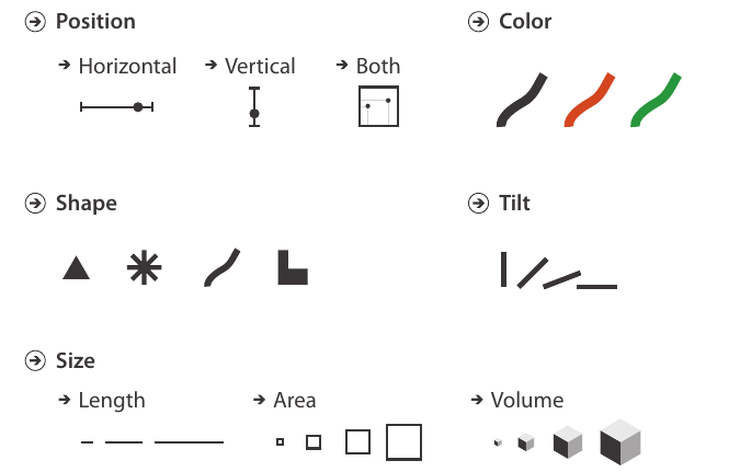
1.2.4 Using marks and channels
1.2.4 Using marks and channels
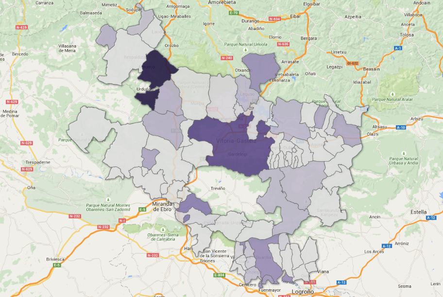
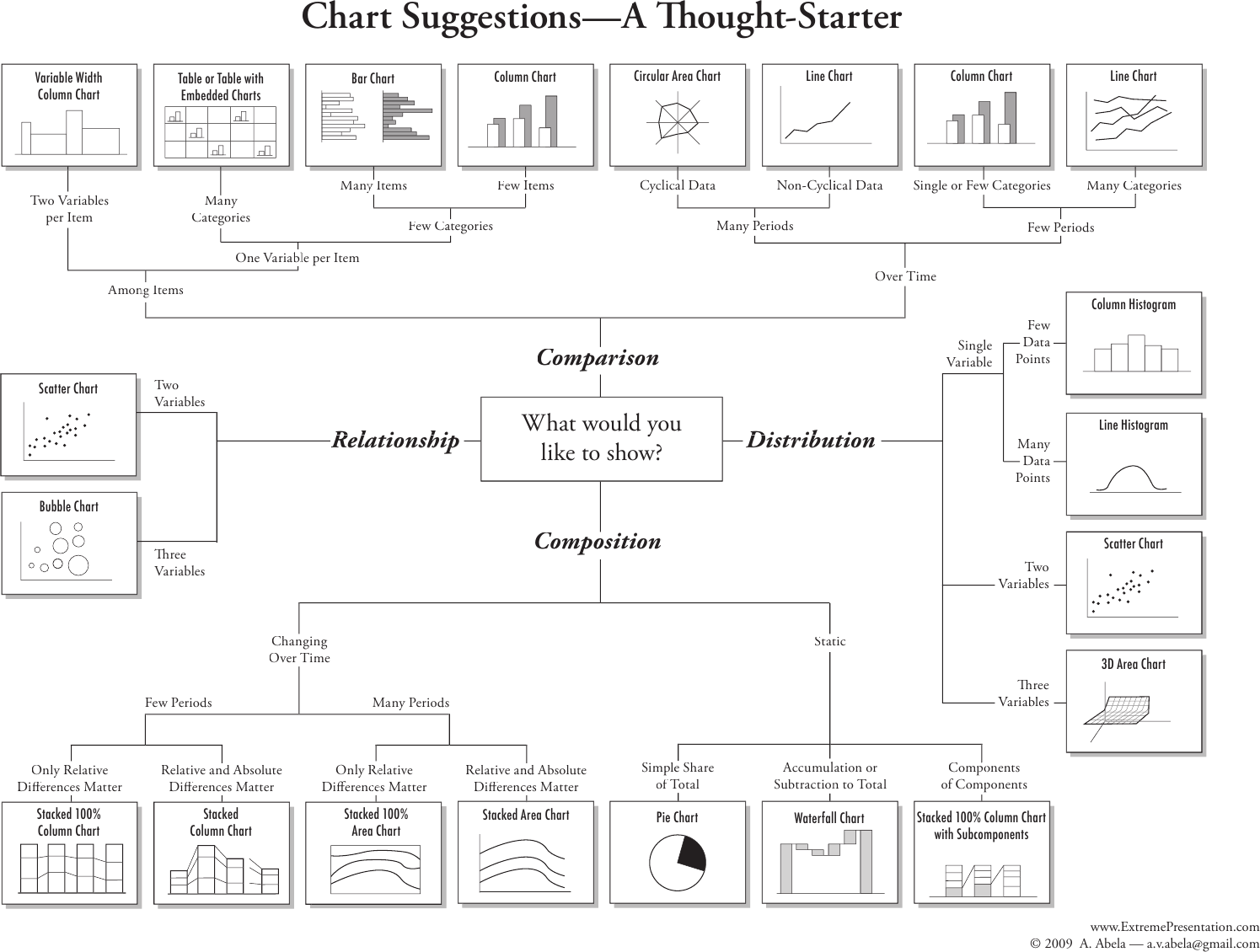
1.3 So, which graph?
2.1 Change default settings
2.1 Change default settings
2.1 Change default settings
2.1 Change default settings
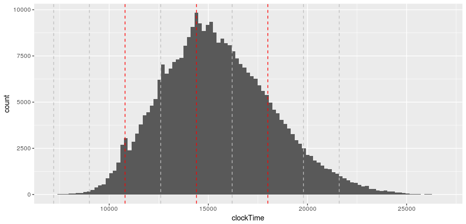
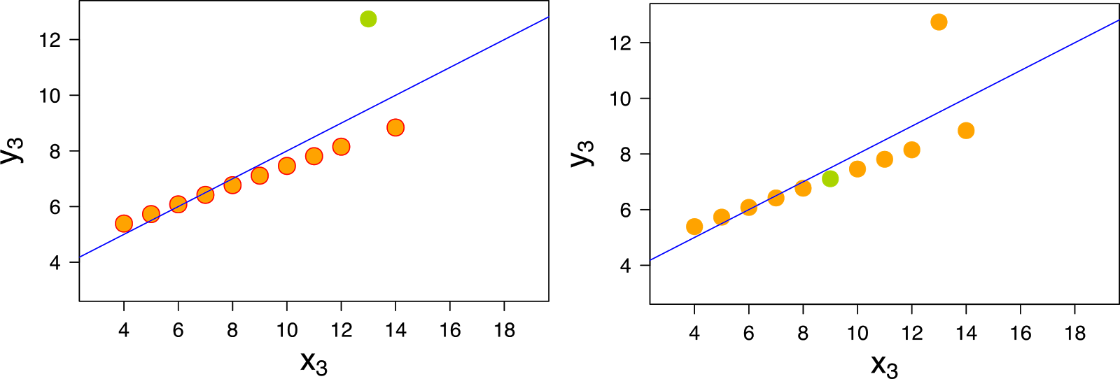
2.3 Highlight observations
2.3 Highlight observations
2.3 Highlight observations
2.3 Highlight observations
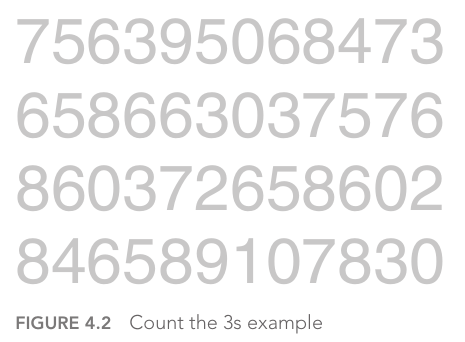
![Nussbaumber, Do you see it? The importance of contrast when communicating with data [video]](img/nussbaumer-contrast.png)
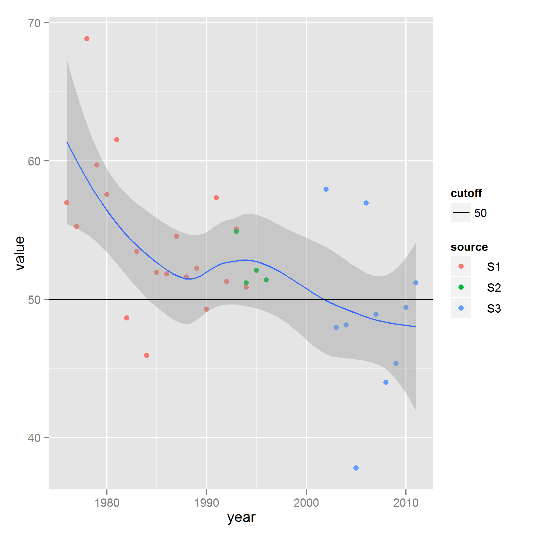
2.4 Add variables (as context)
- Adding preexisting variables (in moderation)
- Creating conditional variables from preexisting variables
- binaries or with few levels are best
- example of calculated field or variable: weekend date
2.5 Add statistical information
- statistical summaries
(mean, variance) - models
Tableau: (not so) basic graphs
Tableau: (not so) basic graphs
Tableau: (not so) basic graphs
Tableau: (not so) basic graphs
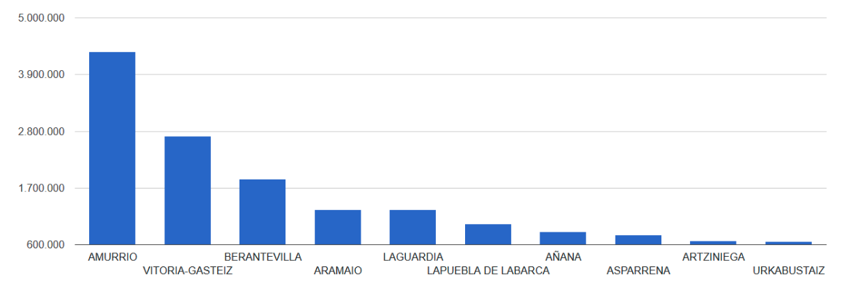
3.4 Example
License
![]()


Copyright © 2018 University of Deusto
This work (except for the quoted images, whose rights are reserved to their owners) is licensed under the Creative Commons “Attribution-ShareAlike” License. To view a copy of this license, visit http://creativecommons.org/licenses/by-sa/3.0/